A few days ago, I visited the Colours of Impressionism
exhibition in Singapore. It had numerous paintings by Monet, Renoir and Manet,
from the Musée d’Orsay in
Paris.
Impressionism is a style of painting that depicts scenes
from everyday life using short, quick strokes and different angles of light. It
uses bold blends of colour and is a way for the artist to show his impression
of the scene in front of him. Impressionism originated in Europe during the 19th
century. The exhibition was held in the National Gallery of Singapore.
Here’s what my experience was like!
When I entered the first room, I was struck by so many
different paintings…all in black, white and grey. But as I went closer, I
realised that the paintings weren’t done in smooth black paint. The artists had
mixed different primary and secondary colours to form black, white and grey
shades. That’s why no two shades of black looked exactly the same! I learnt
that when Impressionism had just started, paintings were done in very dark
colours.
Two of these paintings that I particularly liked are Le Bain
by Alfred Stevens, and Clair de Lune sur le Port de Boulogne by Edouard Manet.
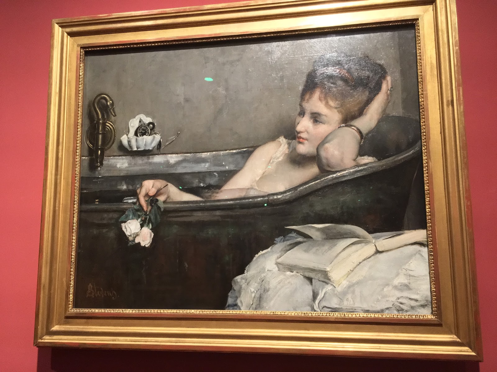
Le Bain (The Bath), Alfred Stevens

Clair de Lune sur le Port de Boulogne (Moonlight over the Port of
Boulogne), Edouard Manet
Then we went into the next room. The paintings in this one
were blue and green. I read that Impressionism had started with black shades,
moved on to blues and greens, and finally evolved into pinks and purples.
In the second room, I saw a stunning painting – La Seine à Port-Villez. I immediately
wanted to know who the artist was. Of course, it was by Claude Monet, one of
the most famous and talented Impressionists.

La Seine à Port-Villez (The Seine at
Port-Villez), Claude Monet
Once we saw the paintings with blues and greens, we moved on
to the next section. I think that one was my favourite.
Here, we saw loads of paintings by Paul Signac. The
speciality about them was that the whole painting was created by dots. When you
look at the paintings from a distance, they seem….like any other. But when you
go closer, you see the individual dots clearly! Blue and white dots for the sky
and clouds, orange dots for the sun and green dots for the trees and bushes.

La bouée rouge (The Red Buoy), Paul Signac
I really loved this painting of a castle. It looks like it’s
from a fairytale!

The Château des Papes in Avignon (The Pope’s Palace in Avignon), Paul
Signac
I liked the bright and bold blending of so many different
colours and shades. You could actually see the artists’ brush strokes in the
paintings. That was unique because most paintings I have seen look smooth – in
these, you can actually imagine the artist painting them!
I think I’m very lucky to be able to see original artwork by
wonderful artists like Monet – the exhibition even had one of his most famous
works: The Water Lily Pond Pink Harmony – and I hope that one day I can see Van
Goghs and Picassos too!
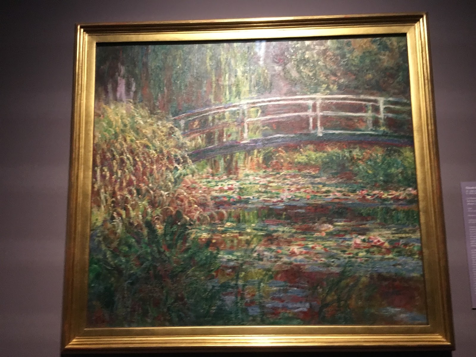
Water Lily Pond: Pink Harmony, Claude
Monet

La Pie (The Magpie), Claude Monet
This blog originally appeared on Singapore for Kids.


No comments:
Post a Comment